Color is an incredibly powerful tool when it comes to interior design, but choosing even a single color to paint the walls with can be stressful, let alone choosing and implementing a color scheme for the whole room. It’s easy to look at a paint chip or color wheel and find a color you like, but it’s much, much harder to build a room around it – particularly when you get your paint sample home and the color you loved on paper is only so-so the second it hits your walls. That said, there are lots of color combinations that are pretty much guaranteed to work together, and popular palettes that have a nice sense of unity and will help keep your room looking on trend. We’ve compiled a list of a few of the most popular and distinctive color combinations for 2015, as well as a few suggestions on how to put them to use in your own home.
Neutrals With A Twist

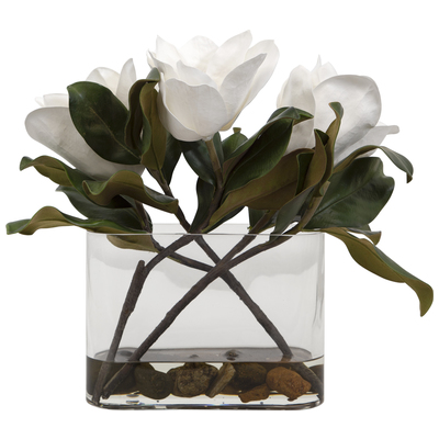
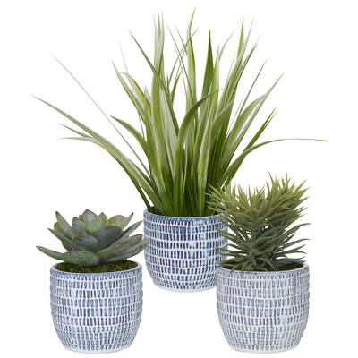
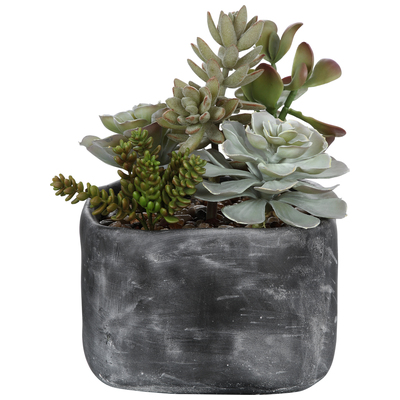
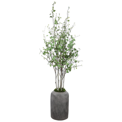
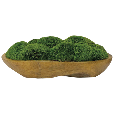
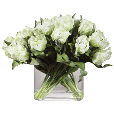
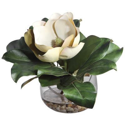
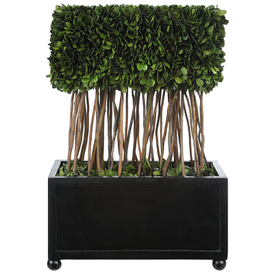
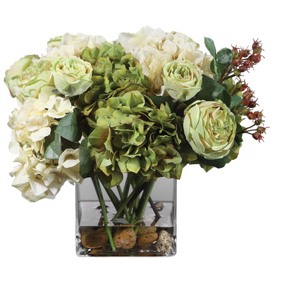
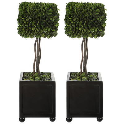
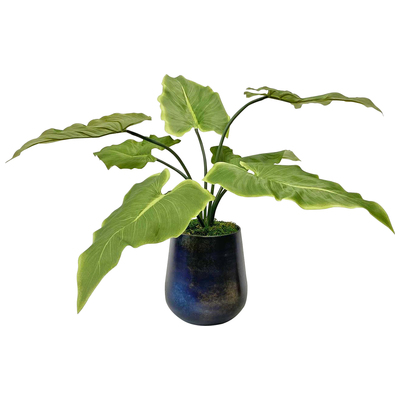
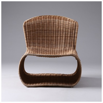
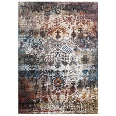
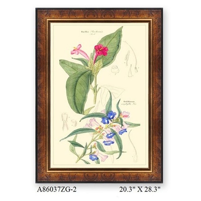
Shop Botancals:


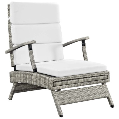
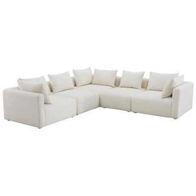
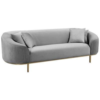
Natural neutral colors are always a safe choice for the major elements of any living space or bedroom; they’re easy to dress up or down, and change subtly when paired with different colored accents or wall paint. One notable trend this year, though, is the shift toward gray-based neutrals rather than beiges, off-whites, and tans. Where brown-based neutrals tend to feel relaxed and natural, gray feels very posh and sophisticated, and is a great choice if you want your room to feel a little more refined. This year, large gray elements are commonly being paired with vivid purple accents. Ranging from orchid to lilac, these purple add-ons bring out the color in gray upholstery and paint, keeping a gray-on-gray decor from feeling too stark or barren.

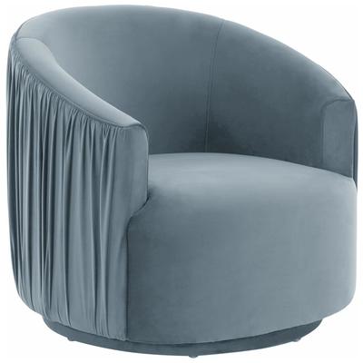
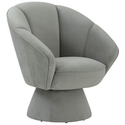
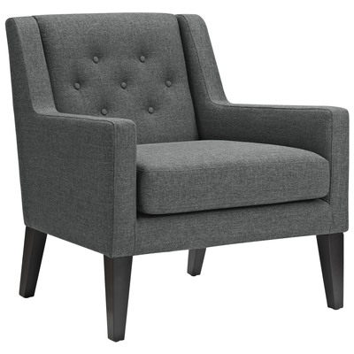
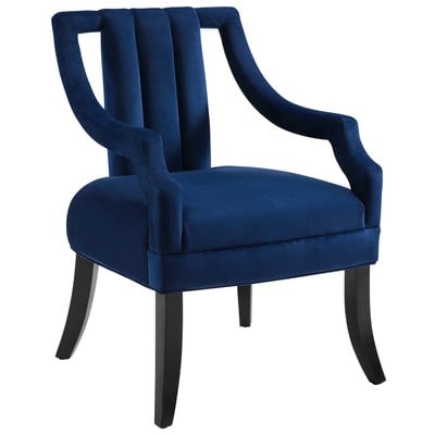
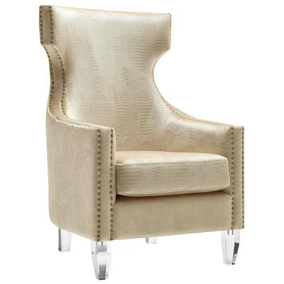
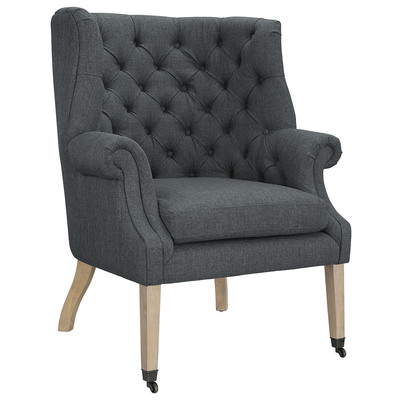
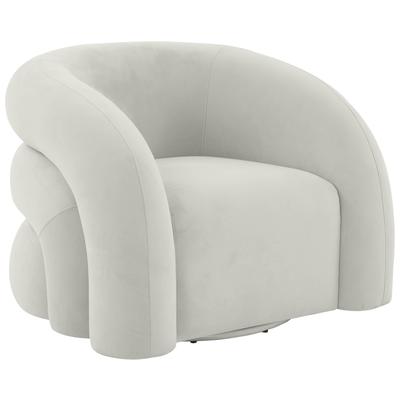
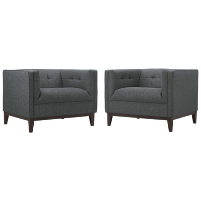
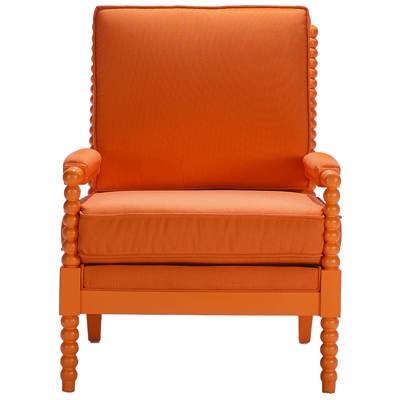
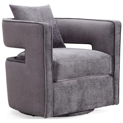
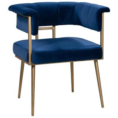
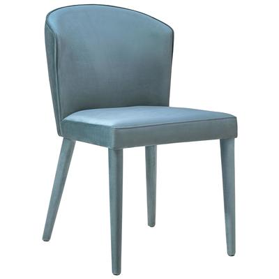
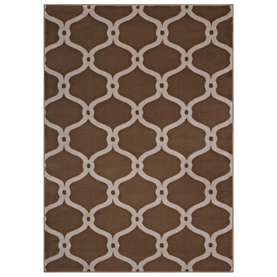
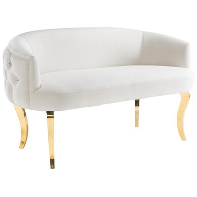
Shop Accent Chairs:
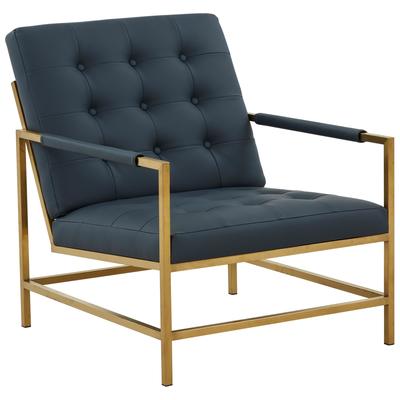

Be wary of adding too much purple – purple walls or anything larger than an accent chair can quickly overwhelm a room – but a little bright pop of color will add pizzazz and flair to the space. Since gray is a naturally transitional color, this palette works equally well in a traditional or contemporary space, but you might want to adjust the intensity and tone of the purple accents accordingly. Neon-bright, pink-based purples are a great, bold choice for a cool contemporary palette, while more mellow royal purples or lilacs add a softer touch to a more traditional decor.
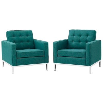
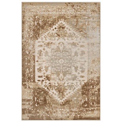
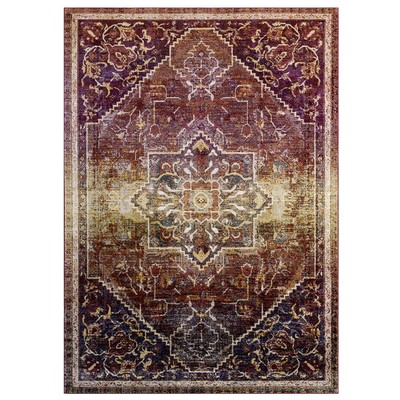
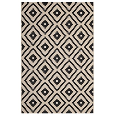
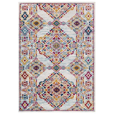
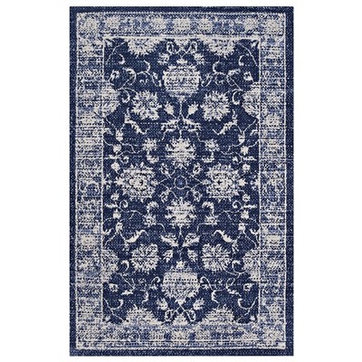
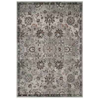
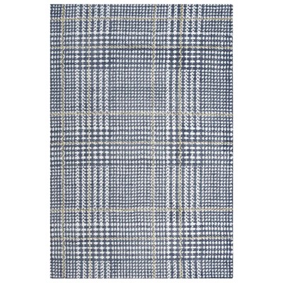
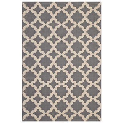
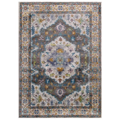
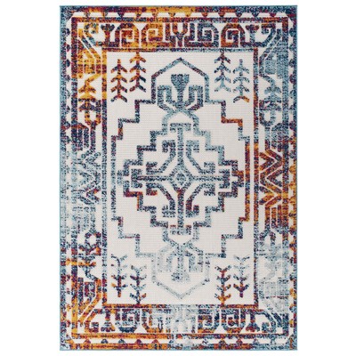
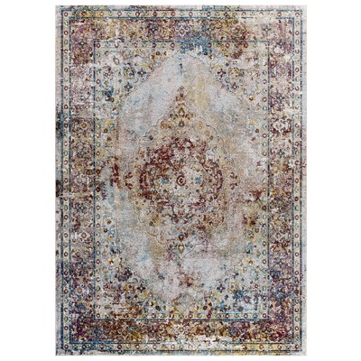
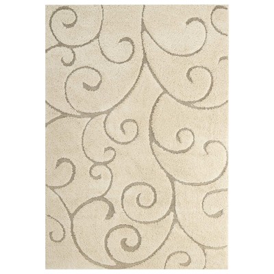
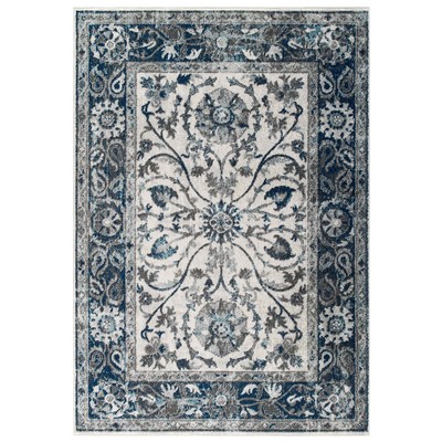
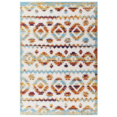
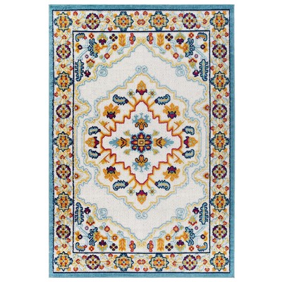
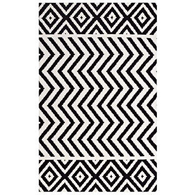
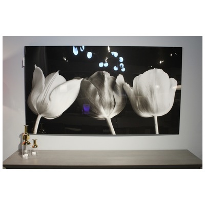
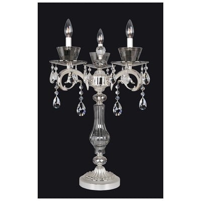
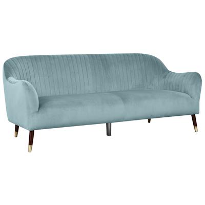
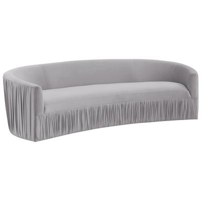
Purple Plus

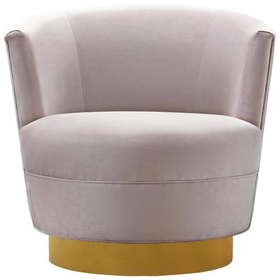
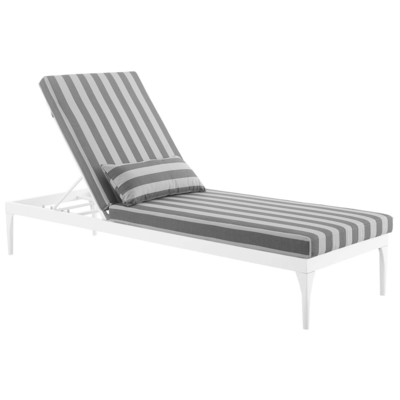
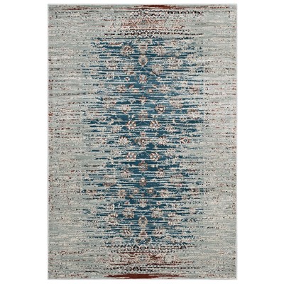
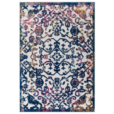
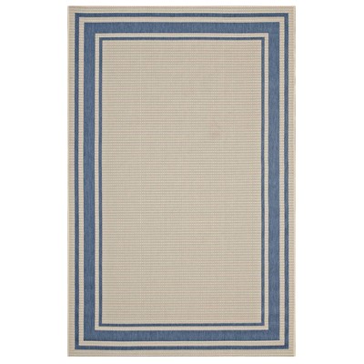
Shop Rugs:


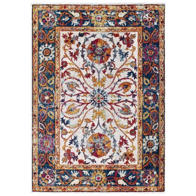

If you want a look that’s a little less stark and a little more lively, stick with slightly more mellow purples and grays that have more colorful undertones, then add in pink, pale blue, or (if you’re feeling bold) a chartreuse or greenish mustard yellow accents. This might seem like an odd combination, but having a strong yellow element will help tone down an intense, vivid purple, making the space feel bright and inviting without being quite so in-your-face. Adding in a little beige or light toffee tones can also keep the space feeling warmer. If you want a look that’s bright and colorful but doesn’t have the same intense, striking contrast, spreading out your colors rather than sticking with one intense shade is a good way to get “cheery” rather than “chic.”
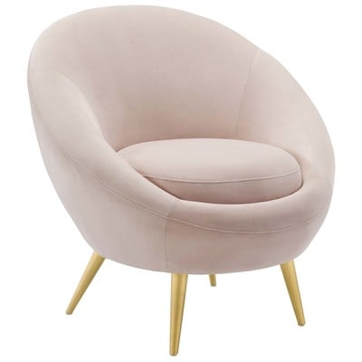
Go Bold
")
Shop Wall Art

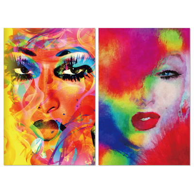


Purple is the star color in a lot of the most popular palettes for 2015, but it certainly isn’t alone – bold colors in general have been becoming much more common as we shift away from more traditional color schemes. On paper, a mishmash of assertive colors seems like a disaster waiting to happen, but with a little care, combining very distinctive colors is a great way to create an inviting, eclectic feel. The room above improbably pairs a pinkish wine purple with two intense shades of teal, but the eye-catching white molding and equally colorful artwork give the room a nice sense of unity. Here, every color of the rainbow is represented, but they aren’t all neon bright. While the turquoise chair is the visual focal point of the room, the burnt brown/orange and light tan combination on the painting, giraffe, and table, as well as the slightly muted red, purple, and green give the impression of color without overwhelming the senses.
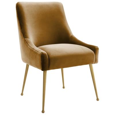
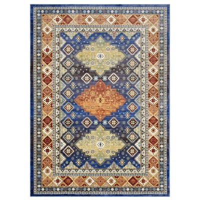
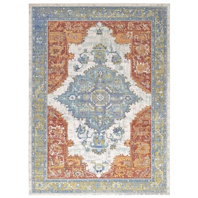
Southwestern Flair

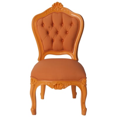
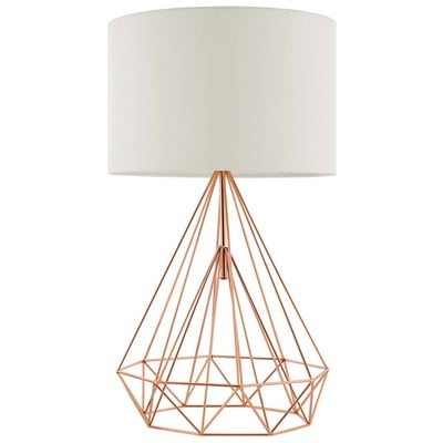
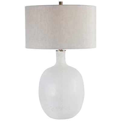
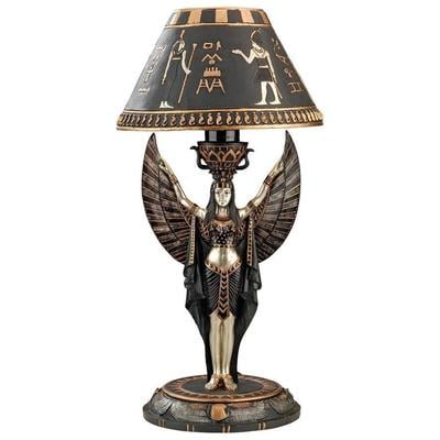
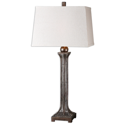
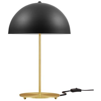
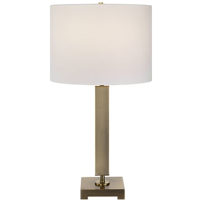
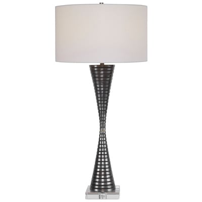
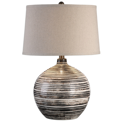
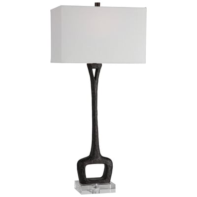
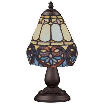
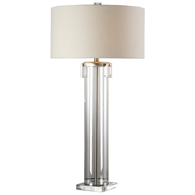
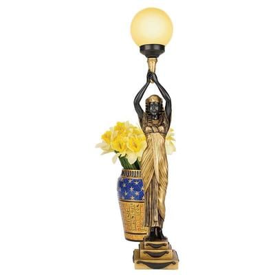
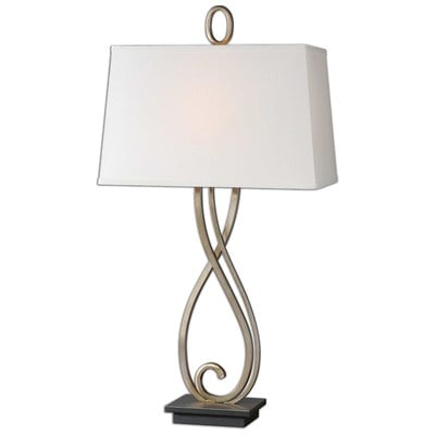
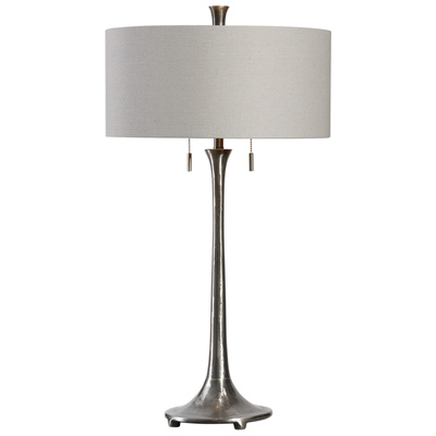
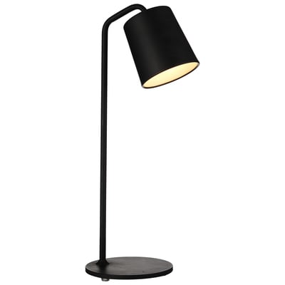
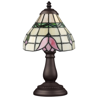
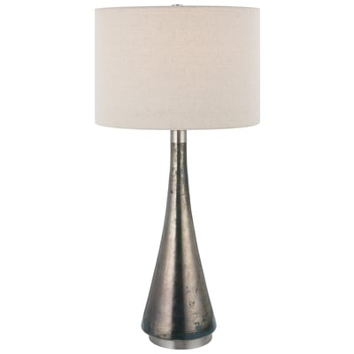
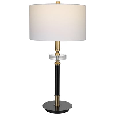
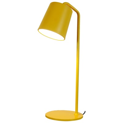
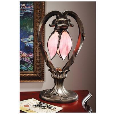
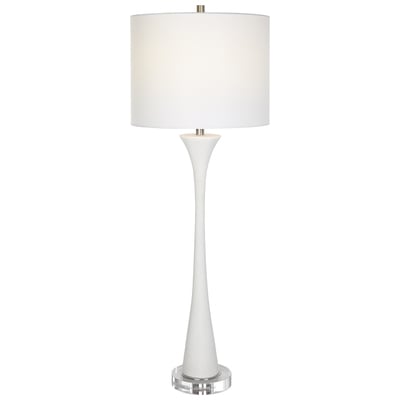
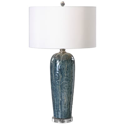
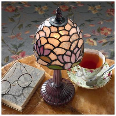
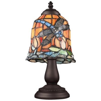
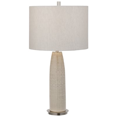
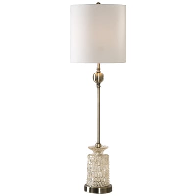
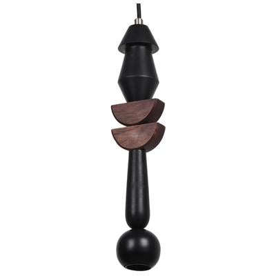
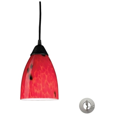
Shop Decorative Lamps:
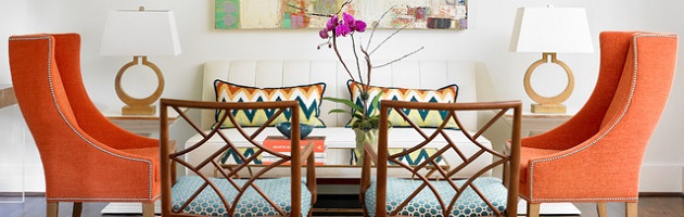
If you’re wary of going all-out with a very diverse color palette, but like the idea of incorporating some intense colors into your decor, a safe way to do it is to pick two complimentary colors, choose one shade of one, and several varying tones of the other. I touched on this with multiple shades of purple + chartreuse, but turquoise or teal blue paired with many multiple shades of orange is also very trendy this year. Generally this pairing has a bit of a southwestern flair to it, but it’s easy to amp up or mellow out the intensity of this palette by adjusting how much and what color orange accents you use. For example, a very bold, distinctive true-orange or burnt orange will stand out a lot more strongly, while lighter oranges and orange-yellows can fade to beige for a more neutral look that still has a distinctive and vibrant personality.
Color Families
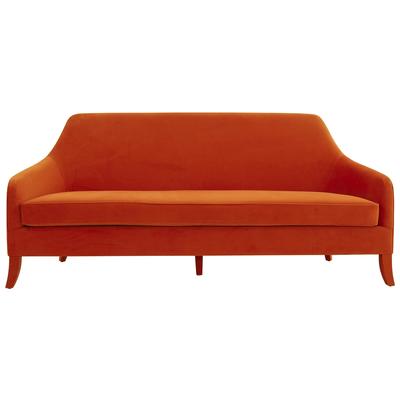
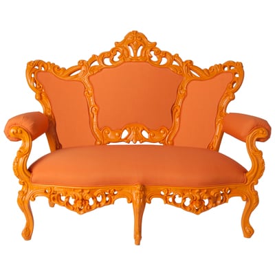
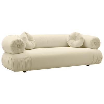
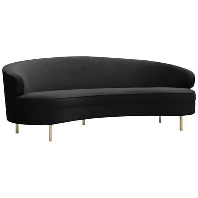
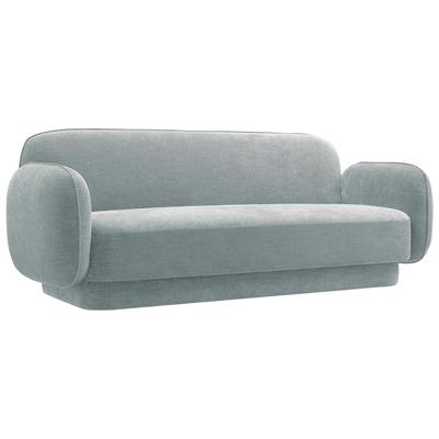
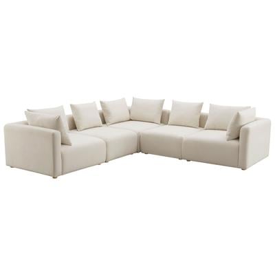
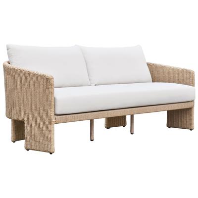
Pink and orange is not a color combination for the faint of heart, but orange walls are very trendy this year, and lively hot pink accents make this look really vivid and charming (Photo by Rikki Snyder)Shop Sofas:


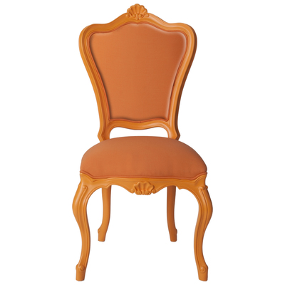
Another good way to ensure your color palettes are cohesive is to stick with colors in the same color family. Pick any two adjacent colors on the color wheel, and any tint tone or shade in between is fair game, but you’ll still have a distinct overarching theme. Decorating this way also makes it basically impossible for the colors you choose to clash, no matter how wild a shade you choose. A great example of this is another surprisingly popular color pairing this year: red, pink, and orange. Everything from brick red to mustard or marigold (plus orchid or fuchsia) is on the table for this color scheme. This combination might sound like a recipe for a dorm room disaster (and it can certainly veer in that direction if you aren’t careful), but balanced out with a little white, light blue, or springy green, this palette can have a very cheerful, slightly exotic feel. It certainly isn’t for the faint of heart, but with the right fabric patterns, it can be well worth the payoff.

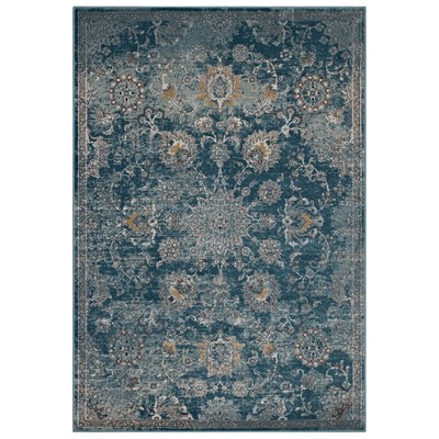
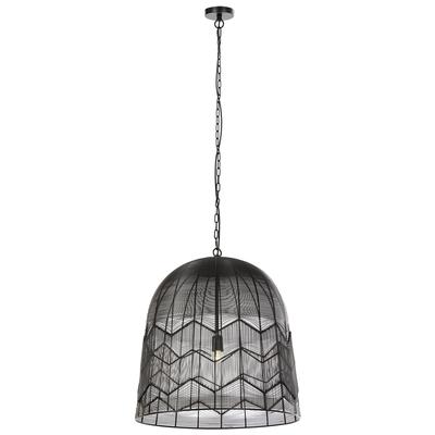
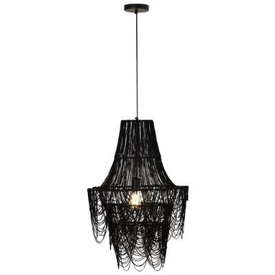
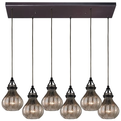
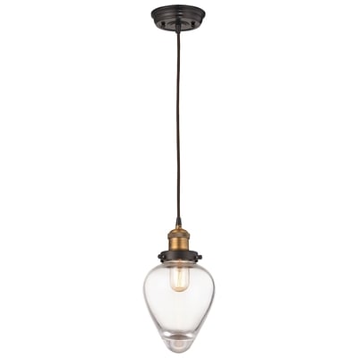
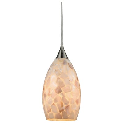
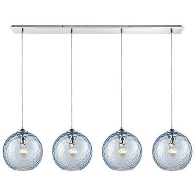
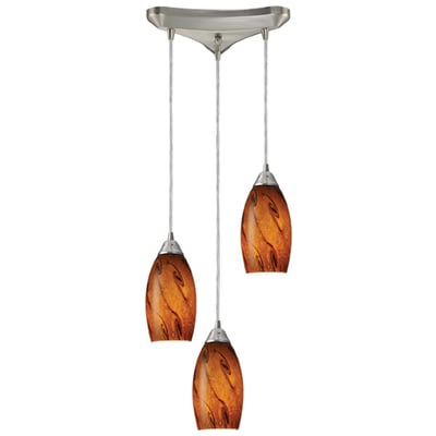
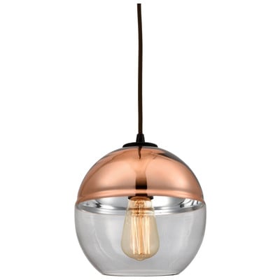
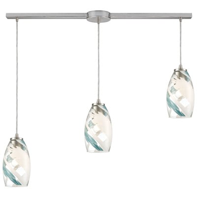
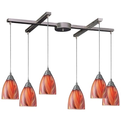
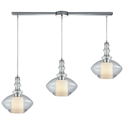
Shop Lighting Pendants:
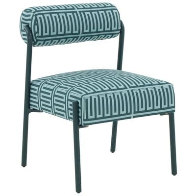
Of course, sticking with a single color family can be much more subtle as well. Sticking to shades of blue and green is a good way to create a much more relaxed, calming space. Deep navy blues that fade into teals, sky blues, and dusky greens are particularly popular this year, especially when accentuated with silvery gray, golden beige, or just a little touch of red. Now, if you’re looking for a very bold, intense look, this palette will abide (think: teal walls), but personally I think it works best when paired with white walls and soft neutrals. You can layer as many variations on blue as you want, but putting in that little touch of red or beige keeps it from feeling too monochromatic, so the color scheme feels unified but not heavy-handed.

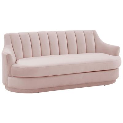
Layering shades of peaches and pink is another popular palette this year, but once again the combination on paper is a bit deceptive. While warm pinkish pastels might make you think of gramma’s house or a princess bedroom (and again, it’s all too easy to wind up there), this combination can actually work brilliantly in a living space, provided you even it out with light nude beiges or soft, warm-toned grays. While creamy off-whites will make a lot of pink look nursery-ready, gray has a similar impact that it does on pinkish purples: it makes the pastels feel more assertive and modern, creating warm, cheery contemporary style that stops short of feeling overly feminine.
Whether you prefer bold, intense colors, or if you’re just looking to put a fresh twist on a more traditional color scheme, there are a lot of great, flexible options this year. If you aren’t feeling confident, remember to start small; fewer colors is always safer, but don’t be afraid to go for something vivid to make your room really shine. What do you think of the color trends for 2015? Will you be redecorating this year?