It’s that time of year again, when taste-makers, trend-setters, designers, and analysts all start talking about color – new trends, new palettes, and one breakout color to lead the design world for the coming year. But 2016’s color of the year is more than a little surprising. In contrast to the vibrant gem tones of the last few years, 2016’s color is… Simple White. All across the design world, variations on soft, subtle off-whites are predicted to be at the forefront of this year’s trends, but it’s important to note that that doesn’t have to mean bland, sterile spaces – you just have to know how to use the color right.
Layered Off-Whites

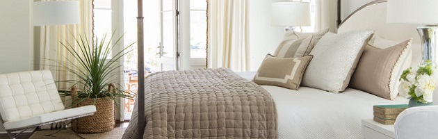
In recent years, white-on-white spaces have been quite popular, from cottage style bathrooms to farmhouse style kitchens that are pure, solid white from top to toe. But 2016 is more about off whites than true whites; you won’t see the same unbroken, glossy white, but instead, lots of layers of different shades of off white. Going a shade darker or lighter for your paint, trim, upholstery and accents creates a room that, rather than being blindingly paper-white, has a soft, warm feel to it. All whites take to sunny spaces well, but a room done in off-whites with a yellow or beige undertone will feel cozy and sun-soaked even in a room with less natural light. Off whites also have a subtly more elegant, transitional feel than pure whites, which tend to read very modern.
Layered Neutrals

Taken to the next level, layering “off whites” can also mean layering all kinds of neutral colors, from almost-whites and light canvas tones to darker beiges, tans, browns, and grays. This is a trend that’s already starting to come into its own, because it’s a great way to build a room that feels colorful and visually diverse without actually committing to a colorful palette. The recent rise in popularity of the color gray has had a big hand in this trend (and will continue to be a popular tone in 2016), but sticking to a baseline off white will help keep the space feeling light, open, and balanced. A layered neutral color scheme is also a great option if you’re thinking long term; it’s easy to reaccessorize a neutral space with new colors, and since neutrals never go out of style, this is one look that won’t look dated when next year’s color trends come around.
Wintery Pastels

I’m going to go ahead and count pastels as “off white,” too. While mostly the word is used to refer to ever-so-slightly yellow or beige tinted whites, very light, frosty shades of blue, purple, pink, and green are going to be quite popular in 2016 as well, especially set against an off-white backdrop. Rather than a return to pale floral colors, though, this trend is definitely an offshoot of the popularity of the color gray; it’s not baby blues and pinks you’ll see in 2016, but ashy, dusky pastels with gray undertones and a very soft, muted feel, intended to add just the barest touch of color to an otherwise light neutral color scheme. Once again, this marks a general shift to a more refined transitional style, but it’s also a color scheme that pairs well with weathered gray wood and distressed white finishes for a delicate, feminine shabby-chic style.
Contrast

On the absolute opposite end of the spectrum is a trend that’s less about blending similar tones to create a soft, mellow look and all about making dark colors stand out against a light backdrop. This trend is one that’s been kicking around in a few different forms, but will really gain traction in the coming year. This color pairing is often used to accentuate and to give a space a modern feel. That means mostly white or off white spaces with smaller black or dark-colored accents (hardware or lighting in a bathroom, furniture or door or window trim in a living space, and so on). But this year expect bigger and bolder contrasts, with black accent walls, black cabinets and appliances in the kitchen, and back tile backsplashes, especially in the kitchen. Pairing black accents with off white rather than true white will make the look a little softer and less stark, as will adding in a wood element, but how intense you want to go – and the balance of black versus white – is really up to you.
White and Wood

2016 is also going to see the continued popularity of another tried-and-true combination: white and natural wood, but this time with an even stronger emphasis on warmth and texture. Switching from a pure white to a very subtle off white again means getting more mileage out of a room’s natural light, but unlike some of the other popular palettes for 2016, this combination sticks very closely to a light off white, and doesn’t layer it with other colors. Instead, you’ll see whitewashed walls, white ceilings, white furnishings, white accents, and even white floors paired with a few strategic pieces of warm toned, heavily weathered wood. Antique barn beams and barn doors have a great architectural feel, and unfinished, slightly rustic wood accent furniture helps carry the hand-hewn, humble, slightly rustic ambiance through the space. If you absolutely need a little more color than wood can afford, stick to earthy greens and deep, muted yellows to give the space a slightly more natural feel.
Color and Trim

All that said, despite the prevalence of shades of white in 2016’s color trends, the bright, vivid colors that have been gaining popularity in recent years aren’t going away. Many of the year’s more popular colors are, admittedly, skewing toward the gray end of the spectrum, but for the bold of heart, hyper-saturated spaces with mixed, eclectic palettes are also going to be on-trend this year. Teal, mustard yellow, bright orange, hot pink, and royal blue can all be mixed and matched to make brilliantly eclectic spaces with a very funky modern feel, or used individually or in pairs to brighten up more mellow neutral spaces. Either way, using off-white trim – especially on colorful accent walls – is a good way to help ground the space. Off white crown molding, wainscoting, or other detailing doesn’t feel quite as sharp as pure white, but it can help direct the eye in a space that has a lot going on, color-wise.
On the surface, off white might not seem like a terribly exciting color – certainly not one to build a whole interior around. But done right, it can be a surprisingly elegant option, and a good base for a wide variety of different styles.