What’s this? Another color of the year? Well, yes and no. Benjamin Moore is a paint retailer, not a color institute, so their proposed trend of 2017 is more a marketing push than an aggregation of projected trends. It’s advertising. Still, I like the idea and their choice, and honestly, who put Pantone in charge of colors anyway? So if you, like me, are looking for something a little more film noir than ‘greenery‘, check out Benjamin Moore’s pallet of the year, moodily summed up as shadow.

If you check out Benjamin Moore’s website, you will notice that they do things a little differently from Pantone. They provide a whole pallet for their pick; it’s a theme, rather than a single color. The choices span from the palest off-white to a rich, dark red. It’s a darker, drearier direction than Pantone’s fresh, hopeful look toward spring, but also decidedly more elegant. Shadow seems to center on grays and violets, the colors we naturally associate with the onset of dusk or the slow progression of a storm across the afternoon sky. Maybe it’s the high school goth in me, but this shadow pallet gets me substantially more excited than Pantone’s cheery green.

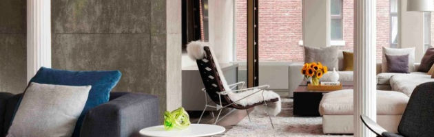
Since it’s really more of a theme than a color choice, the possibilities of how to utilize ‘shadow’ are pretty much endless. Benjamin Moore specializes in paint, but wall color isn’t the only way you can go here. The dark, moody tone can be evoked by all sorts of things–furniture, accents, wall art. I like how the austerity that comes from monochromatic decor–black and white–is downplayed when you include the grays in between.

In their shadow pallet, Benjamin Moore makes sure to put a particular focus on white and off-white. That seems odd at first–isn’t shadow the opposite of white? But what really makes shadows interesting are the interplay of light and dark, and white, of course, is all about light. White is a really great color to build decor around, especially in a room that isn’t going to see a ton of wear and tear. White creates the illusion of more space and has a sleekly contemporary feel.

An interesting element to Benjamin Moore’s intro post to shadow is how they frame the various uses of the color. They name different pictures after different times of day, which really got me thinking about an aspect of home decorating I hadn’t really considered before. Namely, the different ways a room will look depending on the time. It’s an important point to keep in mind, especially when you’re working with a pallet like ‘shadow’. Different sorts of light will effect the surroundings in different ways. So if you are planning to decorate a room that doesn’t get much light, maybe err toward the lighter side, to prevent things from becoming dingy.
Building your decor around shadows may seem like a moody and frivolous choice–like when my teenage sister wanted to paint her bedroom ceiling black–but I really think Benjamin Moore is on to something cool here. Even if your aim isn’t to stay on-trend or buy paint from this retailer, it can be a great resource to pull ideas from.