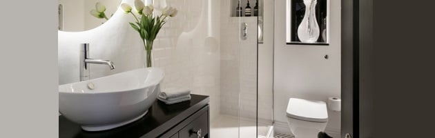
The layout of this bathroom by Shanade McAllister-Fisher is a designer’s nightmare: it’s small, cramped, narrow, and without a single window to help brighten up the space. It’s literally too small to be photographed from inside the room. And yet, the smart use of contrast and light not only saves this small bathroom from feeling cramped and crowded, it actually gives it a really nice designer look and feel – and the techniques used are surprisingly easy to replicate.
Small bathrooms can be a real challenge to work with – especially if you have to compensate for a lack of natural light (by Shanade McAllister-Fisher)How It Works: There are three main things going on in this bathroom: light, contrast, and a little bit of visual trickery. The lighting is the most important. Because there isn’t any natural light, there’s a big bar to clear if you don’t want the bathroom to look dark and dingy, and that means going above and beyond with lighting fixtures. The “main” lights in the room (the recessed lighting overhead) is the minimum must-have, and about what you’d expect to find in a small bathroom. But you’ll notice these lights aren’t even turned on in this photo, because there’s so much accent lighting to supplement them that they aren’t even needed. Not only is the mirror backlit, but the whole wall around the vanity is framed with LED lights, as is the recessed shelf over the toilet. It’s enough light to make the white tile feel bright even without a window. Flipping on the overhead lights tones down a little of the drama of the very-white accent lights, but gives the space a slightly warmer feel.
Adding a dash of contrast is a tried-and-true technique for adding a little style to a small bathroom, and I think this one does it particularly well. The space is predominantly white, which makes the close quarters feel more open, but the white is made whiter by the inclusion of a solid black vanity, the black detailing on the tile, and the black door. Simply put, the added contrast keeps the space from feeling monolithic, and the sharp difference between the black and white elements helps ensure the white stays looking white, rather than gray or dun.
Finally, the bathroom uses two simple but smart visual tricks to make the space look just a tiny bit bigger than it is. First, the lit (and slightly obscured) mirror at the far end of the bath adds depth to the room, making it look like it extends farther than it does by subtly doubling the space (that big vase is an important part of the illusion – otherwise you’d be looking yourself in the face as soon as you open the door!). Second, the frameless shower door makes it possible to shoehorn in an impressively large shower stall for the space, simply because the clear, uninterrupted glass doesn’t visually close off the corner of the room. It’s a little tight, and a full-sized bathtub would probably crowd both the toilet and the vanity, but the simple, lean shower stall fits the space perfectly.
Get The Look: Start off the look with a sleek black open-shelf vanity and a white vessel sink, then top it off with a backlit mirror and accent lights. You definitely want a frameless shower enclosure (preferably one with sliding doors rather than ones that swing open and closed), and a tankless toilet to help save a little space. With the tile, you’ve got a few options: either white tile printed with a thin black pattern, a black and white mosaic tile, or even just a white tile with dark grout. Put ’em all together, and you’ve got a beautiful bathroom, even if you don’t have a ton of space.