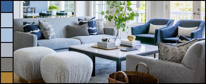
For a lot of people, all-gray color schemes have worn out their welcome. After all, too much gray (especially if it’s all one shade) can quickly feel muddy and bland; am all-gray color scheme lacks the contrast you need to make your space feel interesting. But if you’re looking to test out your design muscles and are hoping for a fail-proof color palette, gray furniture and accessories should absolutely be in your tool box – along with a generous dollop of dark blue. This living room by Kat Lawton Interiors is a great example of this palette working well. So let’s break down the why.
Why It Works:
The beauty of “gray” as a color is that it’s far more than just a single tone – it’s anything and everything in between black and white, with rarely more than a drop of color. This is a huge advantage for anyone redecorating a room on their own, especially if you’re shopping entirely online. Why? Because it means that any shades of gray, including multi-tone and patterned grayscale fabrics, are almost guaranteed to match. Better still, the more different grays you pile into the same space, the better; even slightly different tones are enough to add that much-needed contrast that’s often lost in very matchy-matchy gray spaces.
The key, though, is to make sure you add a few dark blue elements. A vibrant navy blue is a timeless classic that will bring out the “color” in a desaturated gray. It’s a great trick to make your space seem space is more colorful than it actually is. A few hints of gold, brass, or even fresh greenery will round out the look and give you a space that’s anything but boring.
Get The Look:
The beauty of decorating with a blue and gray color palette is that it gives you a lot of room to mix, match, and experiment without the fear of failure. That said, the durable, versatile gray sofa is always a good place to start; (there’s a reason I always recommend them). Next, really go wild with your throw pillows. Pick patterns or solids, in black and white, blue, gray, or any combination. Pairs are good for consistency, but having fun here is one of the key advantages of choosing a “no-fail” color palette. Once your sofas are looking swanky, keep accessorizing. Choose ottomans in a different shade of gray (bonus for a different texture) and a few navy blue accent chairs. Gold or brass elements on either will help add a little more warmth and contrast to your space as well.
A black and white coffee table is another good element of contrast. The one above is relatively simple, but don’t be afraid to get creative. Double-layering a jute rug and wool rug is a trendy choice; the jute acts as a warm neutral base, even if it’s mostly hidden by the light blue-gray rug on top. Finally, I think the use of wall paint here is genius: a very, very pale tone of blue to brighten and unify the living room, and a more saturated version of the same color in the adjacent room that makes the whole look pop.
If you want to try your hand at interior design, but aren’t confident in your ability to make sure everything matches, give yourself the edge by choosing a color palette that will do the hard work for you!